Controlled
energy.
The Keylayer brand system.
Built for the people building what comes next.

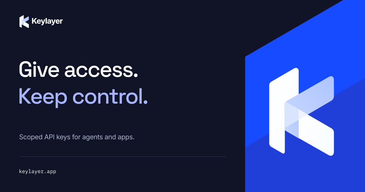
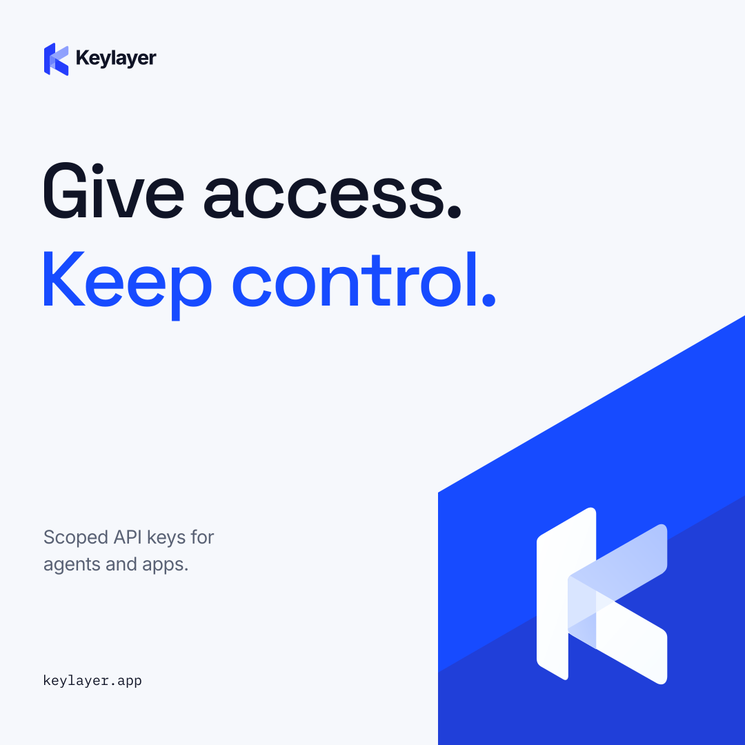
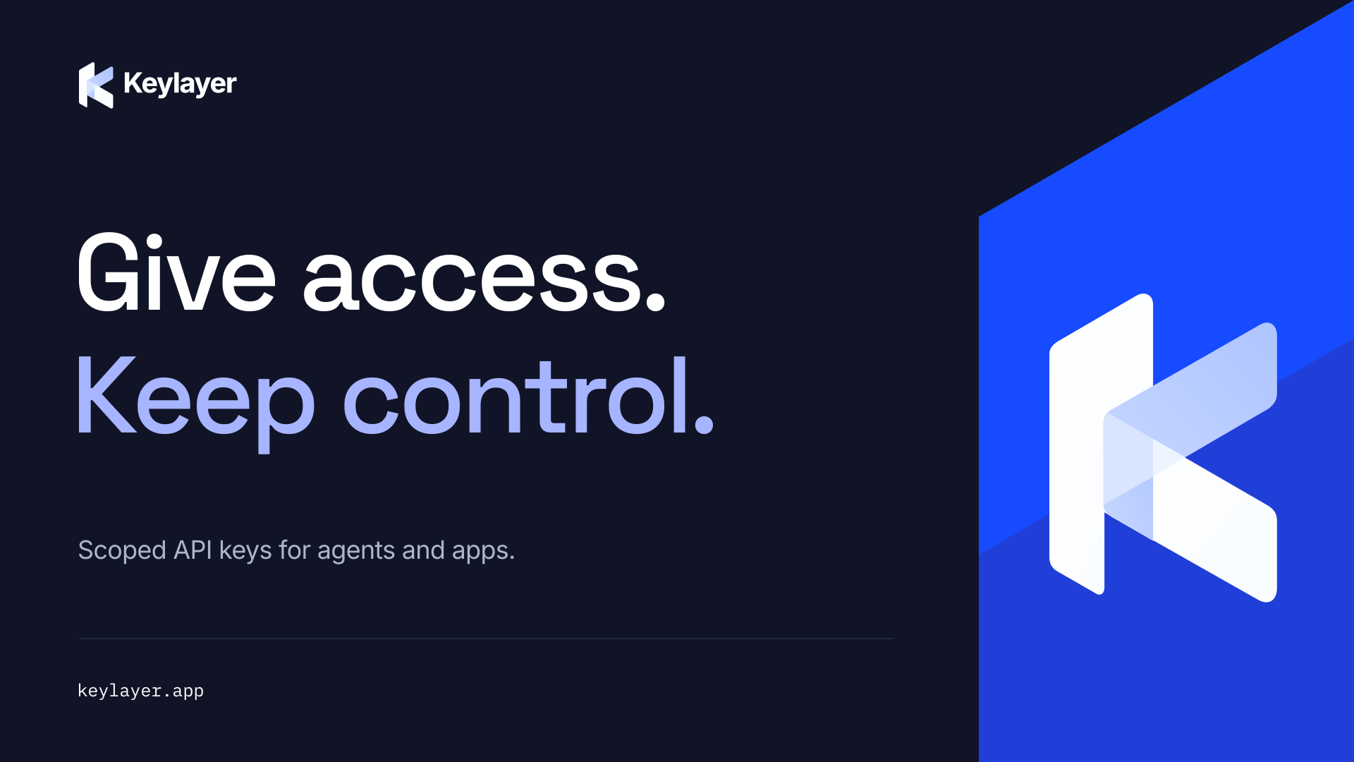
Give access.
Keep control.
Ambition, with boundaries.
We are not here to make builders more cautious. We are here to give them more room to build.
The next great thing should not come with an open tab.
Agents can move fast. API bills can move faster. Keylayer gives each agent or app its own key with limits, so developers can delegate access without handing over their provider secret.
- Control creates confidence
- A clear boundary is permission to move, not a reason to stop.
- Precision earns trust
- Name the limit. Explain the outcome. Be exact about what is and is not covered.
- Power, without theater
- Show the mechanism. Skip the fortress imagery and security superlatives.
Developers shipping AI agents. Small teams sharing API access. The person who owns the bill.
One idea. Three distances.
The farther away the audience is, the simpler the message. Add detail as they come closer.
Position as a credential gateway, not an AI model, autonomous agent or human-approval platform. Current acquisition CTA: Get early access.
A K. With depth.
One recognizable silhouette. Several planes. The mark expresses a layer of control without becoming another padlock.
 Layered / On lightReverse / On dark
 One color / On blue
The six-path master is the source of truth. Its folded planes and open counter make the K recognizable. Never redraw it from a screenshot.
Use the layered mark for digital color. Use the supplied one-color silhouette for small applications, engraving, embroidery and single-ink production.
Give the mark room.
Optical clarity matters more than filling the available space. Use the supplied lockups, not a typed approximation.
xxx = 1/4 of mark height

- Clear space
- Keep at least x clear on all sides of both the standalone mark and full lockup. Measure from visible artwork, not the SVG canvas.
- Master proportion
- Mark artboard: 248 wide by 338 high. Scale proportionally; keep it upright. Lockup gap: H/4, with an 80-unit mark height.
- Wordmark
- Keylayer, with one capital K. The supplied outlined Inter lockup fixes the spacing and weight.
24 px / 7 mmLayered mark height 20 px / 6 mmOne-color mark height
Use the dedicated one-color favicon exports at 16 and 32 px. Elsewhere, these minimums apply. Proof at actual size; raise the minimum for absorbent stock or stitched thread.
Recognizable, every time.
The environment can change. The identity should not.
Do not stretch
Lock the aspect ratio.
Do not rotate
The mark stays upright.
Do not improvise color
Use the supplied variants.
Do not add effects
No glows, shadows or outlines.
Build fasterDo not crowd
Respect the exclusion zone.
Do not lose the silhouette
Switch variant or background.
PartnerCo-branding: equal visual weight, a neutral divider and at least 2x between marks. Use each partner's approved asset; never imply a partnership through decoration.
Electric, not noisy.
Blue is the recognition signal. Ink and paper do the heavy lifting. Everything else has a job.
70% neutral field, 20% brand blue, 10% supporting detail. A campaign may go all blue. A dashboard should not.
#147D64Caution #8A5A00Danger #B42338Status is always a word plus a color. Never use brand blue to mean an error.
White #FFFFFF, muted text #596174, rules #DCE1ED, dark secondary text #ACB5CD. RGB/sRGB is authoritative for screens. Click a swatch to copy its hex value.
Clarity is part of the brand.
Beautiful is not enough if someone cannot read it. These text pairings meet WCAG AA for normal text.
Choose accents for the surface.
Use Ink or Electric text on light surfaces; Lavender or Sky on Ink. Electric on Ink is only 3.03:1, not body-text AA.
Focus must stay visible.
3 px Electric ring on light; Sky on Ink. Use a 3 px offset. Interactive controls have at least 44 x 44 px targets.
Color is never the only signal.
Pair errors and states with a label or icon. Chart series also need labels, line styles or patterns.
Ratios calculated from sRGB relative luminance, rounded down to two decimals. Text target: 4.5:1 normal, 3:1 large. Essential UI boundaries: 3:1. Subtle rules are decorative only.
Character. Without costume.
A distinctive display voice, a workhorse reading face and a technical accent. All openly licensed and self-hosted.
Make room
for what's next.
500 / 600. Headlines, campaign lines and large numbers. Sentence case. Tracking -0.04em; never compress the letterforms.
Precise by design.
Clear by default.
400 / 500 / 600 / 750. Body, navigation, controls and the fixed wordmark. Use tabular numbers for spend and rate data.
01 / ACCESS CONTROL
$50.00 / DAY
budget_exceeded
400. Labels, values, code and technical annotations. Never paragraphs or display headlines.
Values are font size / line height in px. Editorial covers may exceed the scale when the layout allows it. Keep body lines near 55-75 characters. Fallbacks: Arial, sans-serif; ui-monospace for utility.
Space is a control surface.
Make one thing matter first. Group what belongs together. Leave everything else room to breathe.
One message.
One next move.
Align the headline, supporting copy and action to a shared edge. Give the illustration a separate field.
Grid
12 columns above 1024 px; 6 on tablet; 4 below 640 px. Max content width 1280 px. Gutters 24 / 20 / 16 px. Mobile outer margin 20 px.
Spacing
4 px base. Prefer 8, 12, 16, 24, 32, 48, 64, 96. Separate sections by 96 px on desktop and 56 px on mobile. Do not space by eye alone.
Shape
4 px labels; 8 px controls; 16 px containers. Reserve circles for avatars or nodes. Square editorial panels keep the visual system sharp.
Make the invisible legible.
The layer is our signature graphic device. Not decoration for its own sake: a way to show separation, scope and control.
- 01 / Planes
- Use three to five parallel planes. Keep the 30-degree diagonal language of the K. A single plane can carry the focal point.
- 02 / Boundaries
- Fine rules and precise corners define a field. Crop a pattern at the edge of the composition, never through the primary mark.
- 03 / Signals
- One clear path, one direction of travel. In explanatory diagrams, label what moves and where it goes.
- 04 / Restraint
- A blue field, not a rainbow gradient. Depth comes from overlap and tonal contrast, not bloom or blur.
Marketing art may be abstract. Product diagrams must distinguish agents, gateway and provider. Layers do not imply cryptographic key splitting or multiple independent vaults.
Useful at a glance.
The logo carries personality. Functional icons carry meaning. Do not ask them to do each other's job.
24 px grid. 1.5 px stroke.
Round caps and joins. A 2 px optical inset where possible. Scale the entire icon; do not mix filled, outlined and 3D icons in one set.
Show the work.
Use real product captures, purpose-built layer illustrations or tightly cropped material studies. One subject, a quiet field, deliberate light.
No security stock theater.
No hooded hackers, neon locks, floating brains, handshakes or invented dashboards presented as live product. Provider marks stay unmodified.
Matte ink. Frosted planes. A clean electric edge.
Dimension without visual noise.
Motion, with a purpose.
Resolve into order. Show what changed. Then get out of the way.
- 140 ms / Feedback
- Button hover, pressed states and color changes. The interface should acknowledge input immediately.
- 240 ms / Transition
- Panels, toggles and a newly changed value. Show the relationship between the old and new state.
- 420 ms / Entrance
- One composed layer entrance, with at most 60 ms between planes. Play once; do not keep bobbing.
- Curve / Consistent
- cubic-bezier(0.2, 0.8, 0.2, 1). Animate opacity and transforms, not layout dimensions.
With prefers-reduced-motion, show the final state immediately. No parallax, perpetual motion or flashing. Never delay real error messages, progress or data to finish an animation.
The product should feel in control.
A quieter application of the same identity. Information first; the brand supports the task.
Research agent
Daily spend / Hard mode
Daily spend cap reached.
This request was not forwarded. Wait for the next period or ask the key owner to review its limit.
budget_exceededValues carry the hierarchy.
Keep units beside numbers. Show used and allowed together. Do not hide scope or period behind a tooltip.
States are explicit.
Active, paused, expired, revoked. Pair the status with words; reserve danger treatment for destructive actions and refusals.
Controls stay predictable.
One primary action per task. Separate pause from revoke. Confirm destructive actions; explain their scope.
Interface studies using illustrative values, not product screenshots. Product teams should validate wording and behavior against the actual API before release.
Sound like the engineer you trust.
Direct enough for a launch. Precise enough for an incident. No swagger where someone needs an answer.
Set a daily spend cap for each key.
Unlock unparalleled AI cost governance.
Hard mode checks the worst-case cost before forwarding.
Never overspend. No matter what.
Key revoked. Ask the owner for a new key.
Oopsie! Your little key has gone bye-bye.
IP address not allowed. Use an allowed network or ask the owner to review access.
CRITICAL: Unauthorized agent detected!
Keylayer, never KeyLayer. Sentence-case headings and buttons. Short sentences, active verbs, contractions when natural. Say API key, not token, when speaking to a general audience. No registered-mark symbol.
Hard spend caps only where supported; estimated mode can go over. Do not claim zero knowledge, universal compatibility, compliance, guaranteed uptime or instant termination of in-flight work. Publish only verified numbers.
Errors follow a simple order: what happened, what it affects, what to do next. Marketing can be playful. Errors cannot be vague. Use actual API codes only when verified.
Make control look desirable.
One thought per composition. A strong line, a recognizable mark and enough restraint to let them land.
Start with recognition.
The K and Electric blue do not need reinvention in every campaign. Change the composition, not the identity.
Protect the message.
Use a quiet text field and a separate illustration field. Keep at least 6% inset on exported social assets.
Keep it honest.
Campaign language can be bold without implying a launched dashboard, unverified performance or universal hard-cap support.
One system. Different surfaces.
From a 32 px avatar to a presentation screen, the identity should still feel unmistakably Keylayer.
 Avatar / 20% safe insetKEYLAYER
GIVE ACCESS.
KEEP CONTROL.
Social profiles
Use only the mark in avatars. Keep it centered within the safe area so both round and square crops preserve its silhouette.
Presentations
Use the supplied 16:9 master. Left-align content, use one focal idea per slide and keep diagrams readable from the back of a room.
Physical production
Start with the one-color artwork. Embroidery needs a vendor stitch test. Foil, engraving and spot ink need a physical proof.
Make the last mile count.
A system is only as strong as the file someone actually uses.
- Digital
- Use SVG for logos and scalable art. PNG is for raster-only destinations. Keep sRGB; export social assets at the supplied dimensions.
- Use the SVG masters as vector sources. Ask the printer to convert through the correct ICC profile. Electric blue will shift in CMYK; approve a physical proof.
- Type & licensing
- Space Grotesk, Inter and IBM Plex Mono use SIL Open Font License 1.1. License texts travel with the kit. Portable SVGs have outlined type; editable templates keep live text. Install the supplied static fonts for Office.
- Files & versions
- Use the versioned kit and PDF together. Never overwrite a local master with a compressed chat attachment. Keep editable sources alongside exports.
- Does the first glance communicate one clear idea?
- Is the correct mark variant used, upright and uncropped?
- Are clear space, type sizes and contrast intact?
- Can the layout survive a narrow screen or small print?
- Are claims, values, statuses and CTA actually true?
- Do fonts, download links and reduced motion work?
- Has the final exported file been inspected at real size?
Bitgate maintains the Keylayer identity. Version 1.0 establishes this system; existing surfaces may transition over time. Update source assets and this guide together when the system changes.
No unprofiled CMYK or Pantone equivalents are specified. Production color depends on ink, stock and process. This guide defines identity usage, not a third-party trademark clearance.
Built to be used.
The actual files. Not a folder of screenshots.
Use this guide alongside the source files. The kit includes color and motion tokens in CSS and JSON, plus a computed contrast report.

Give access. Keep control.